Florin Florea
Graphic Designerpersonal portfolio site
Type & fonts, lettering and calligraphy
I have been attracted by this domain for some time now.
I will present here some of my works and sketches.
I hope I will have more time to actually create fonts for all of them and make them available for download.
Click the thumbnails for a bigger preview.
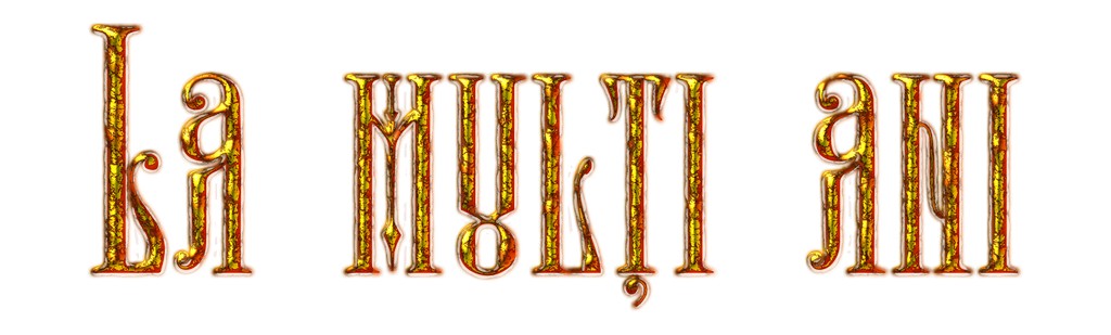
Arhaic Branvenesc and Arhaic Renasterea
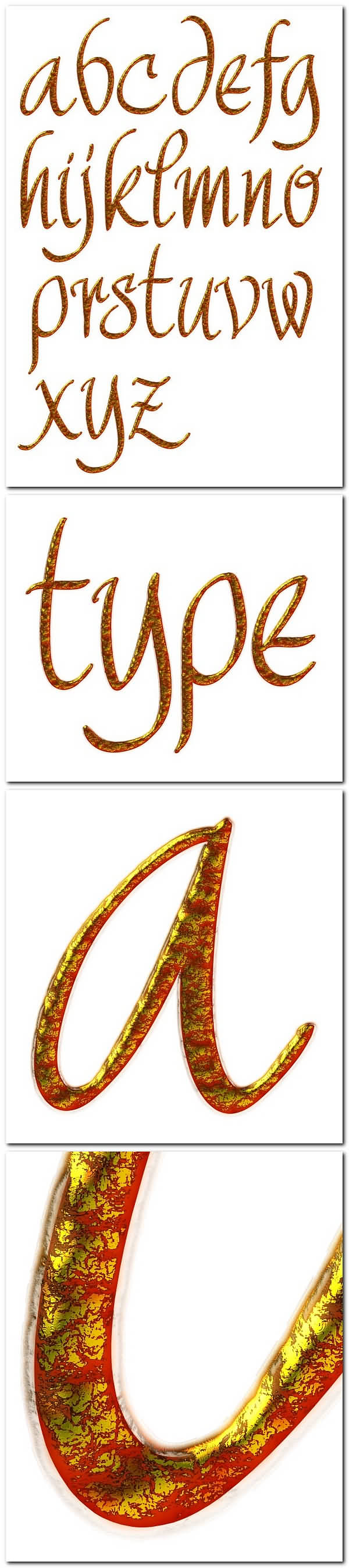
A calligraphic alphabet
Digital calligraphy exercises
Envy - Digital Calligraphy video
My Calligraphy Galleries on flickr
My new site for fonts - florinf.ro
Friends font
Inkscape movies on YouTube
Manualito-Flo - a brush style font
Marker Calligraphy video
Thanks - Digital Calligraphy wallpaper
2 more fonts showcased
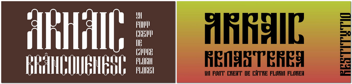
Arhaic Renasterea and Arhaic Brancovenesc showcased on Fonts page. There you may click on each one to see more details about them.
I have started Arhaic Brancovenesc from the structure of a three-parts window from the Mogosoaia Palace, built by Constantin Brancoveanu in 1702.
Arhaic Renasterea started from a single letter R that I liked. I have constructed the whole alphabet and numerals.
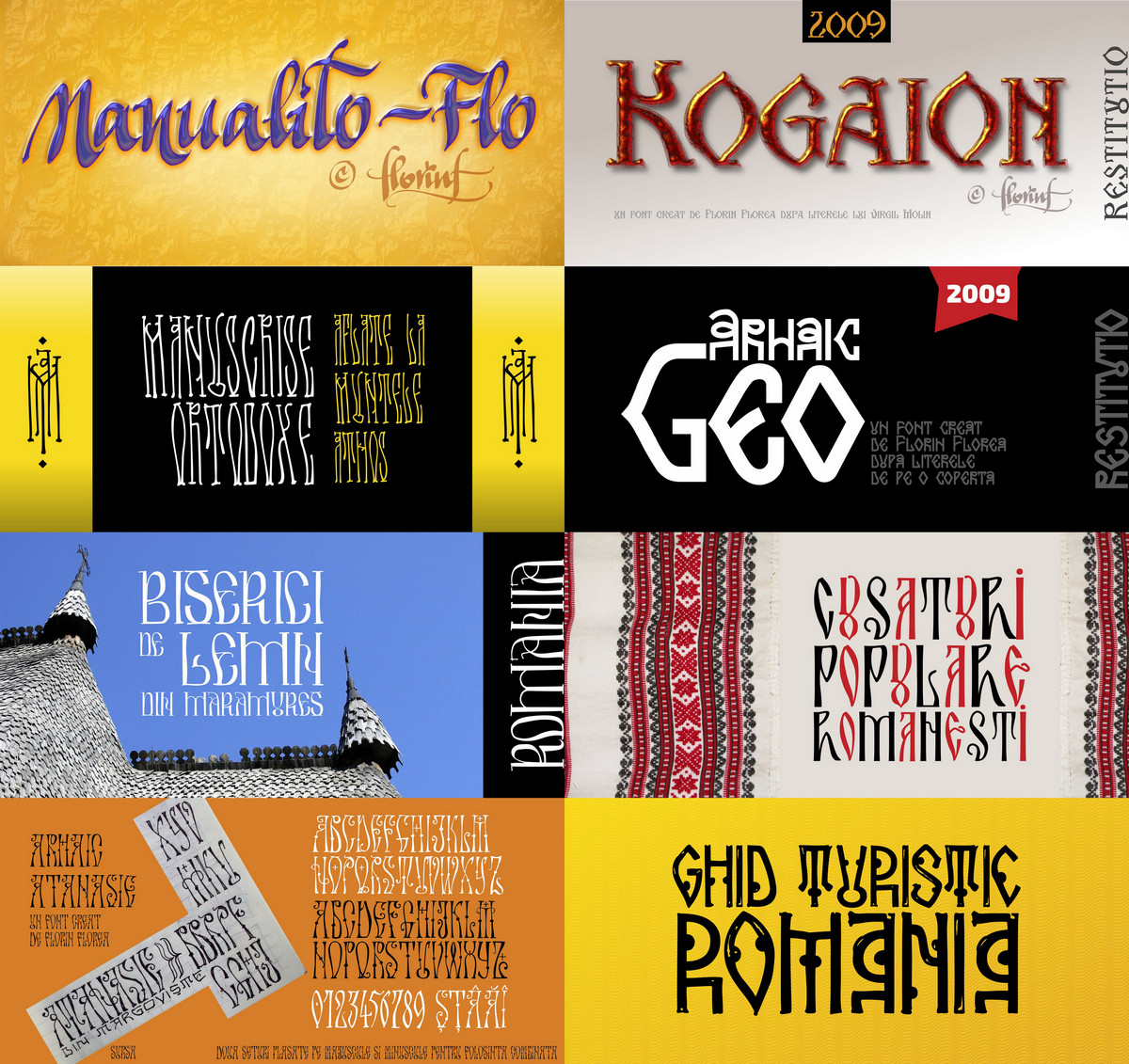
My new site for all my fonts (http://florinf.ro)
Since march 2016 I have a new site for all my fonts and especially the Archaic Romanian (Arhaic Romanesc) ones. Here is a little preview of some of them. Please check florinf.ro to see more info about them. A click on image will zoom in.
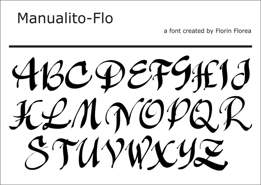
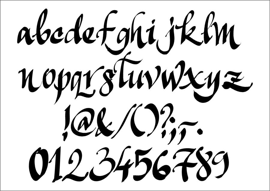
Manualito-Flo - a brush style font
This is a font I created, some time ago (summer 2010), as digital calligraphy in Inkscape. The name is just a reflection of the fact that it was manually created. I have put it on some font sites. On DaFonts it was uploaded on February 28, 2011 and then updated on September 24, 2011 and it has 101,894 downloads (June 12, 2016). This is still work in progress and kerning has to be adjusted depending on the text. It is released as a free for personal usage font. For commercial usage please contact me.
A click on it will zoom in.
 |
 |
 |
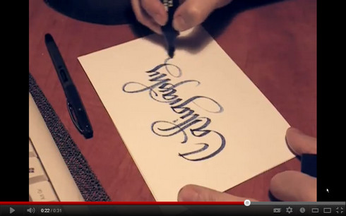
Marker Calligraphy
Calligraphy created using a flat chisel marker. Filmed from a tripod. Uploaded in my You Tube Gallery.
A click on it will pop-up zoom it for play. You can even watch it full-screen.
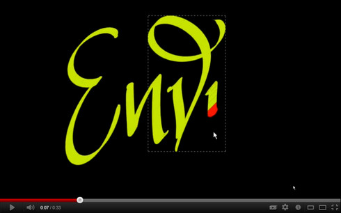
Envy - Digital Calligraphy
Digital calligraphy created in Inkscape. Uploaded in my You Tube Gallery. I also added some of them in my Vimeo video gallery. A click on it will pop-up zoom it for play. You can even watch it full-screen.
My Calligraphy Galleries on flickr
Excellent option for the flickr galleries - a slideshow that can also be played externaly.
Try the fullscreen option. Click one of the thumbnails below first. You can choose the thumbnails or watch the slideshow play. Click on the bigger image takes you to the flickr gallery.
Thanks.
The First Gallery is with my AlphaBattle works for Lettercult.

If it's not working, please go to the flickr site here.
And a second Gallery for the Digital Calligraphy works.

If it's not working, please go to the flickr site here.
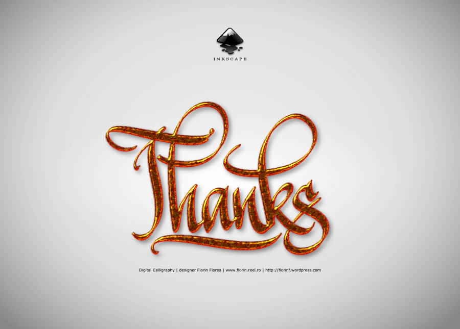
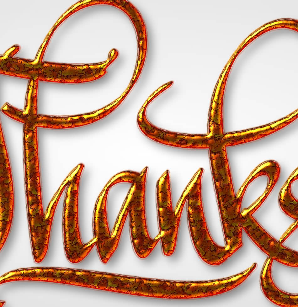
Thanks - Digital Calligraphy
Another work of digital calligraphy created in Inkscape. Also available as a wallpaper on my free downloads page. A click on it will zoom in.
My Inkscape movie tutorials on YouTube
These are some of the videos I have recorded while using Inkscape for my digital calligraphy. I have placed some of them on the net on YouTube and Flickr so that more people will enjoy testing and working in Inkscape. More video tutorials will come. Meanwhile try Inkscape, it's free and very good.
Play them in full screen mode.
This was my first shared video. I wanted to show Inkscape's beautiful calligraphy tool. 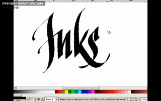
|
This one is about the fact that while drawing a line it can be drawn over using the Alt key pressed so that the new line will cut from the initial (or selected) line. 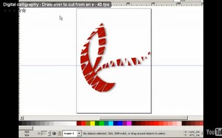
|
This video shows one of my brushes that I called "Curly". The settings are shown on my blog, at the end of the posting (Digital calligraphy samples). 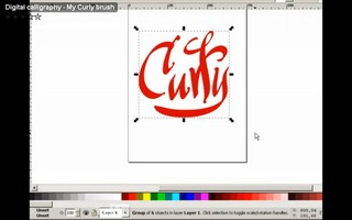
|
This video was recorded while I was playing with one letter (e) and making it look 3D in the 2D vector program. 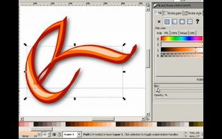
|
Digital calligraphy
Some of the digital calligraphy tests I did. These are entirely worked in Inkscape, so they are vector drawings only.
Click images for zooming in.

A calligraphic alphabet
I'm an Inkscape fan. I do almost all my digital calligraphy works in it, with my Wacom Intuos 3 graphic tablet. Some time ago I have seen the typefaces at the Handmade font and thought I should try something similar. All the letters were written in Inkscape and then used some filters. Each letter can be exported as big as an A4 page. This is work in progrress but almost finished.
Friends font
This is a custom typeface I created (back in 2001) for my visual identity work for "Friends' Club". This is actually finalised as a font, yet the kerning requires more adjustments. It was created only as an exercise/test and is not available for use.
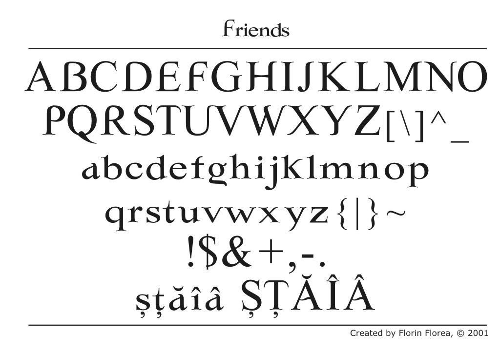

Update:
I did had a request for the font and I had to redraw it from skratch. Now there is a new version called Friends FR 2016 and it is released exclusively for a book for the entire 2016. It will be avalable to others after that. The book is called "The Love Convention" and it is written by Sebastian Burnaz from Arad, Romania. It will be translated in many languages so the font needed many specific characters. I also did the cover.
Thanks.
Go back to the top of this page.